Brand
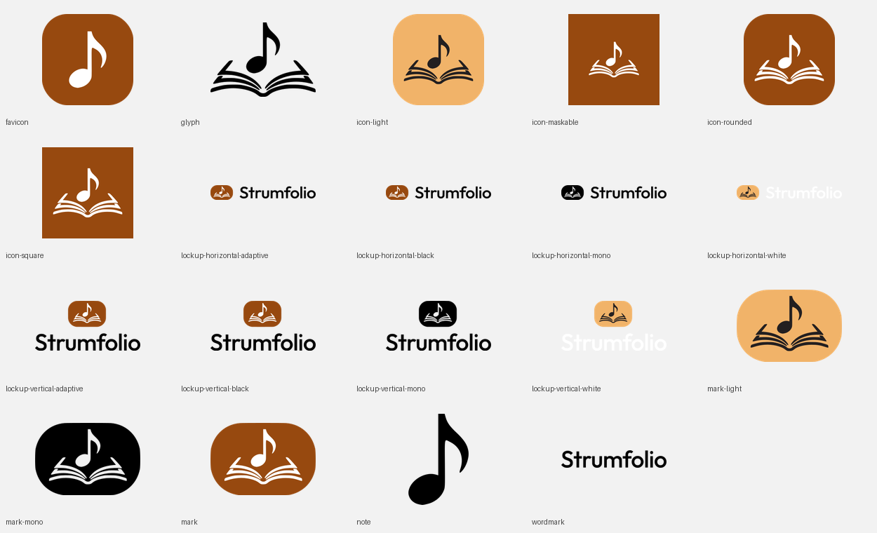
Strumfolio’s logo, app icons and palette, hosted here for anything outside the app that needs them — a store listing, a slide, a signature, someone else’s stylesheet.
Link straight to a file rather than keeping a copy of it: these URLs stay put, and a copy on someone else’s drive is a copy of whatever the logo used to look like. The whole drop sits under /brand/kit/, and its own README is the file-by-file index.
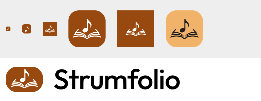
The lockup
Two files, never one recoloured: the lettering is black for a light ground and white for a dark one. The mark and the wordmark are one image on purpose — the space between them is part of the drawing, not something to set by hand.


lockup-horizontal-black.svg7.3 KBon a light ground
lockup-horizontal-white.svg7.3 KBon a dark ground
Stacked instead of side by side, for a column rather than a row — this is what heads the sign-in pages in this app.


lockup-vertical-black.svg7.6 KBon a light ground
lockup-vertical-white.svg7.6 KBon a dark ground
Two more of each, for two specific jobs

Adaptive. The switch happens inside the file, off prefers-color-scheme, so one tag covers both grounds. Reach for it where you cannot ship two files and a CSS rule — a README, someone else’s CMS. Not what this app uses, because what an <img> is told depends on the browser: Chromium hands the image the page’s own colour scheme, and one that hands it the operating system’s instead paints white lettering onto a white page for a reader who chose light.

Mono. Every shape in currentColor, with the glyph knocked out of the tile rather than painted on it. Inline the SVG, or paint it through a CSS mask the way this specimen does — an <img> cannot inherit the colour of the text beside it.
lockup-horizontal-mono.svg7.3 KB

lockup-vertical-mono.svg7.6 KB

Mark, glyph, wordmark
The three pieces on their own, for the places a full lockup does not fit: an avatar, a favicon, a stamp on a corner.


mark.svg3.0 KBon a light ground
mark-light.svg3.0 KBon a dark ground
Without a tile, in your own colour
These three carry no colour of their own: they are currentColor on a transparent ground, tinted here with this page’s own text colour.
glyph.svg2.6 KBnote and book

note.svg655 Bthe note alone

wordmark.svg4.2 KBlettering only

mark-mono.svg3.0 KBthe badge in one colour

Icons
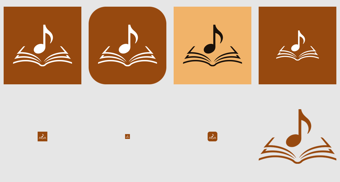
Four tiles, one drawing. Which one you want depends entirely on what is going to round the corners, and on how dark the surface behind it is.

Rounded
Corners already rounded, corners transparent — in-app and on the web, where nothing will round it for you.
icon-rounded.svg2.7 KB

Square
Full-bleed to the edge, for iOS, Android and macOS, which round it themselves.
icon-square.svg2.7 KB

Light
Orange tile, dark glyph — for a dark interface, where the brown tile disappears into the page.
icon-light.svg2.7 KB

Maskable
The glyph pulled inside the middle 60%, so Android can crop this to any shape and lose none of it.
icon-maskable.svg2.7 KB
Favicons, at the size they are actually drawn
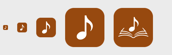
Below roughly 48 pixels the open book stops reading as a book and turns into three grey strokes. That is the whole reason the two small favicons are the note alone rather than the same mark scaled down.
 16pxnote only
 32pxnote only
 48pxfull mark
 96pxfull mark
favicon.svg753 Bwhat a modern browser picks first

favicon.ico4.4 KB16, 32 and 48 in one file, as a fallback
apple-touch-icon.png6.0 KB180×180, no transparency — iOS rounds it

icon-192.png9.0 KBPWA, purpose any

icon-512.png26.3 KBPWA, purpose any

maskable-icon-512.png15.6 KBPWA, purpose maskable

Contents.json2.1 KBthe whole appiconset is in the list below — drag the folder into Assets.xcassets
Link previews and social
Ready-made cards: 1200×630 for a link preview, 1200×1200 for the places that want a square. Three grounds for the wide one, because a card sits on whatever the app showing it decides.

og-image-brand.png24.0 KB

og-image-light.png23.6 KB

og-image-dark.png24.2 KB

social-square-light.png37.6 KB

social-square-dark.png38.6 KB
Palette
Five values, and only the first two are ever a background. Brown and Orange are this app’s own accent in its two themes, to the digit — the colour that marks a chord on a song sheet is the colour of the tile.
- Brown#97490FThe tile, the theme colour, and this app’s light-theme accent.
- Orange#F1B369The tile on a dark ground, and the dark-theme accent.
- Ink#231F20The glyph, when the tile under it is orange.
- Black#000000The lettering on a light ground.
- White#FFFFFFThe lettering on a dark ground, and the glyph on brown.
Using it
- Leave it room. Every
viewBoxis cropped to the ink, with no padding built in — clear space is yours to add. Half the height of the tile, on all four sides, is enough. - Scale, never stretch. Set one dimension and let the other follow: 2336×344 for the horizontal lockup, 1688×804 for the vertical, 499×344 for the mark.
- Pick the file for the ground. Black lettering on light, white on dark, and neither one recoloured to bridge the gap. On a photograph or a mid-tone, use the mark on its own tile rather than the lockup.
- Small means the note. Under about 48 pixels the book closes up. Below that use
note.svgor the 16 and 32 pixel favicons, which are drawn for it. - Don’t rebuild it. No shadows, outlines, gradients or rotations, and no setting the wordmark next to the mark yourself — the lockup files exist so that spacing is never a decision anyone has to make twice.
Every file
The drop as delivered, read off the folder itself. There is no archive to download: link to the file you need.
svg/
19 files · 87.9 KB
- favicon.svg753 B
- glyph.svg2.6 KB
- icon-light.svg2.7 KB
- icon-maskable.svg2.7 KB
- icon-rounded.svg2.7 KB
- icon-square.svg2.7 KB
- lockup-horizontal-adaptive.svg7.3 KB
- lockup-horizontal-black.svg7.3 KB
- lockup-horizontal-mono.svg7.3 KB
- lockup-horizontal-white.svg7.3 KB
- lockup-vertical-adaptive.svg7.7 KB
- lockup-vertical-black.svg7.6 KB
- lockup-vertical-mono.svg7.6 KB
- lockup-vertical-white.svg7.6 KB
- mark-light.svg3.0 KB
- mark-mono.svg3.0 KB
- mark.svg3.0 KB
- note.svg655 B
- wordmark.svg4.2 KB

logo/
31 files · 1.0 MB
- lockup-horizontal-black-1200.png27.7 KB
- lockup-horizontal-black-150.png2.7 KB
- lockup-horizontal-black-2375.png59.4 KB
- lockup-horizontal-black-2446.png61.3 KB
- lockup-horizontal-black-300.png6.0 KB
- lockup-horizontal-black-3000.png76.4 KB
- lockup-horizontal-black-600.png12.8 KB
- lockup-horizontal-white-1200.png28.9 KB
- lockup-horizontal-white-150.png2.9 KB
- lockup-horizontal-white-2375.png62.2 KB
- lockup-horizontal-white-2446.png64.2 KB
- lockup-horizontal-white-300.png6.3 KB
- lockup-horizontal-white-3000.png80.0 KB
- lockup-horizontal-white-600.png13.4 KB
- lockup-vertical-black-1200.png42.9 KB
- lockup-vertical-black-1823.png69.3 KB
- lockup-vertical-black-200.png6.0 KB
- lockup-vertical-black-400.png12.9 KB
- lockup-vertical-black-600.png19.8 KB
- lockup-vertical-black-800.png27.4 KB
- lockup-vertical-white-1200.png44.3 KB
- lockup-vertical-white-1823.png71.8 KB
- lockup-vertical-white-200.png6.3 KB
- lockup-vertical-white-400.png13.4 KB
- lockup-vertical-white-600.png20.8 KB
- lockup-vertical-white-800.png28.5 KB
- mark-black-1024.png32.7 KB
- mark-brown-1024.png48.9 KB
- mark-white-1024.png37.9 KB
- wordmark-black-1600.png26.4 KB
- wordmark-white-1600.png29.1 KB































icons/
35 files · 400.8 KB
- icon-light-1024.png56.1 KB
- icon-light-128.png5.8 KB
- icon-light-192.png9.0 KB
- icon-light-256.png12.2 KB
- icon-light-32.png1.1 KB
- icon-light-512.png26.0 KB
- icon-light-64.png2.6 KB
- icon-note-1024.png32.4 KB
- icon-note-64.png1.6 KB
- icon-rounded-1024.png56.6 KB
- icon-rounded-128.png5.8 KB
- icon-rounded-144.png6.6 KB
- icon-rounded-152.png7.0 KB
- icon-rounded-16.png515 B
- icon-rounded-180.png8.4 KB
- icon-rounded-192.png9.0 KB
- icon-rounded-256.png12.3 KB
- icon-rounded-32.png1.1 KB
- icon-rounded-48.png1.9 KB
- icon-rounded-512.png26.3 KB
- icon-rounded-64.png2.7 KB
- icon-rounded-96.png4.3 KB
- icon-square-1024.png44.7 KB
- icon-square-128.png4.5 KB
- icon-square-144.png5.2 KB
- icon-square-152.png5.4 KB
- icon-square-16.png375 B
- icon-square-180.png6.5 KB
- icon-square-192.png7.0 KB
- icon-square-256.png9.6 KB
- icon-square-32.png833 B
- icon-square-48.png1.4 KB
- icon-square-512.png20.5 KB
- icon-square-64.png2.1 KB
- icon-square-96.png3.3 KB



































web/
28 files · 319.4 KB
- apple-touch-icon.png6.0 KB
- favicon-16x16.png442 B
- favicon-32x32.png806 B
- favicon-48x48.png1.9 KB
- favicon-96x96.png4.3 KB
- favicon.ico4.4 KB
- favicon.svg753 B
- head-snippet.html635 B
- icon-1024.png44.7 KB
- icon-192.png9.0 KB
- icon-512.png26.3 KB
- icon-maskable.svg2.7 KB
- icon-rounded.svg2.7 KB
- icon-square.svg2.7 KB
- lockup-horizontal-adaptive.svg7.3 KB
- lockup-horizontal-black.svg7.3 KB
- lockup-horizontal-white.svg7.3 KB
- lockup-vertical-adaptive.svg7.7 KB
- lockup-vertical-black.svg7.6 KB
- lockup-vertical-white.svg7.6 KB
- mark.svg3.0 KB
- maskable-icon-512.png15.6 KB
- og-image-brand.png24.0 KB
- og-image-dark.png24.2 KB
- og-image-light.png23.6 KB
- site.webmanifest552 B
- social-square-dark.png38.6 KB
- social-square-light.png37.6 KB











ios/AppIcon.appiconset/
16 files · 80.4 KB
- Contents.json2.1 KB
- icon-1024.png40.1 KB
- icon-20@1x.png424 B
- icon-20@2x.png1022 B
- icon-20@3x.png1.7 KB
- icon-29@1x.png692 B
- icon-29@2x.png1.6 KB
- icon-29@3x.png2.7 KB
- icon-40@1x.png1022 B
- icon-40@2x.png2.4 KB
- icon-40@3x.png3.9 KB
- icon-60@2x.png3.9 KB
- icon-60@3x.png6.0 KB
- icon-76@1x.png2.3 KB
- icon-76@2x.png4.9 KB
- icon-83.5@2x.png5.5 KB









preview/
10 files · 383.4 KB
- contact-sheet.png69.3 KB
- diff_small.png17.8 KB
- diff_zoom.png5.4 KB
- favicon-check.png16.4 KB
- final-check.png38.4 KB
- svg-diff-horizontal.png28.7 KB
- svg-diff-vertical.png32.1 KB
- svg-diff.png28.7 KB
- svg-sheet.png118.2 KB
- vertical-check.png28.5 KB